Empowering Advertisers with Data: Advanced Analytics Tool
Company
Meta
Role
Lead Designer
Duration
6 months
Tags
B2B, Analytics

Overview
The Advanced Analytics tool was designed to give enterprise advertisers the ability to analyze their ad performance and leverage data from Facebook to answer key business questions. However, the complexity of the tool, particularly around SQL knowledge, made it difficult for many advertisers to fully utilize its features. My task was to lead the redesign of the Template Composer and other key features to make the tool more user-friendly and accessible.
Problem
Our research showed that the Advanced Analytics tool was not meeting the usability expectations of enterprise users. The onboarding process was overly complex, and advertisers who lacked technical expertise were struggling to leverage the tool effectively. This was leading to limited adoption and hindering the broader rollout of the product.
🧠 SQL Complexity
💡 Lack of Guidance
⚙️ Template Creation
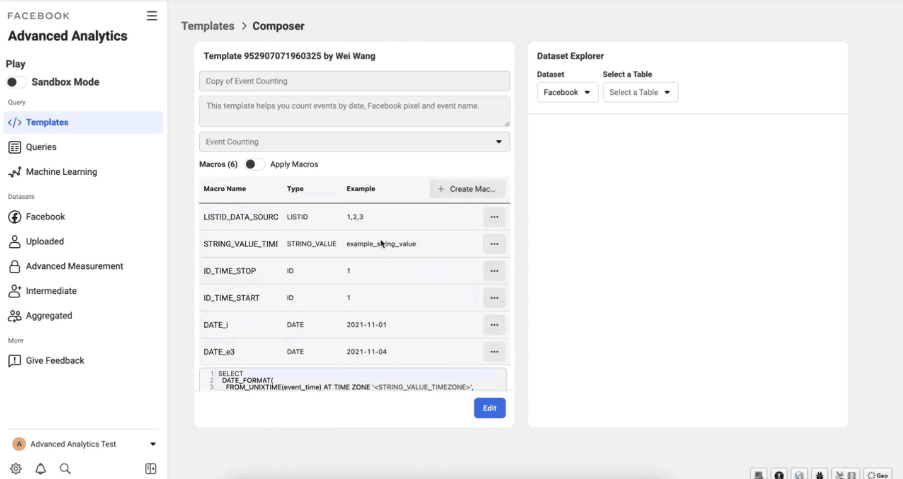
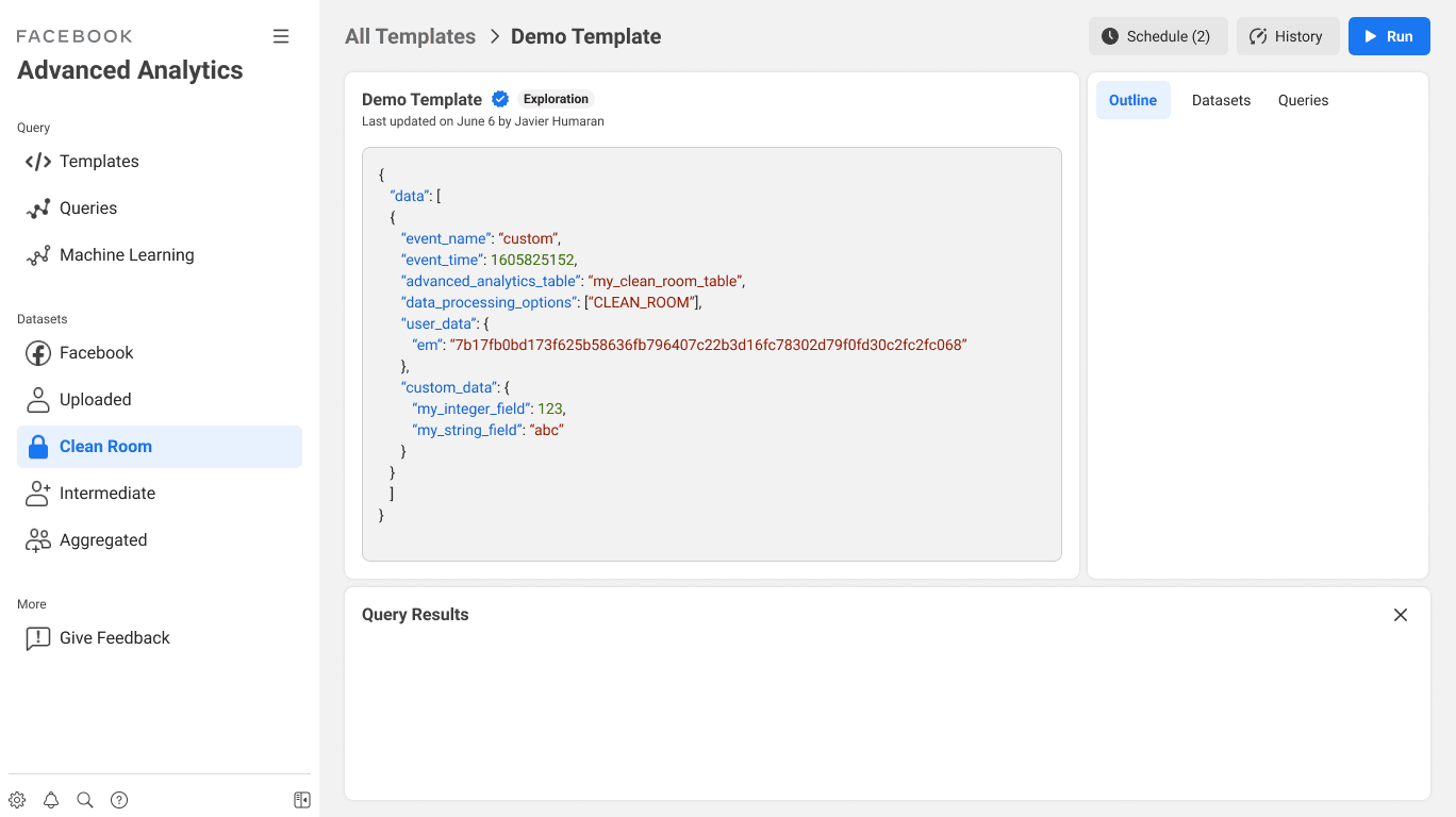
This is how the Template Composer of the Advanced Analytics tool looked before the redesign.
“Advertisers with limited technical expertise are finding it difficult to create custom reports. The tool feels too advanced, and we often resort to external data analysis to get the insights we need”
Research Study Participant
Solution
I led the redesign of the Template Composer, focusing on simplifying the user interface and improving accessibility for both advanced and less sophisticated users. We adhered to Meta’s Geodesic UI guidelines to maintain consistency and applied best practices for in-context guidance. This helped users—especially those with limited SQL skills—better understand how to create, modify, and use templates.
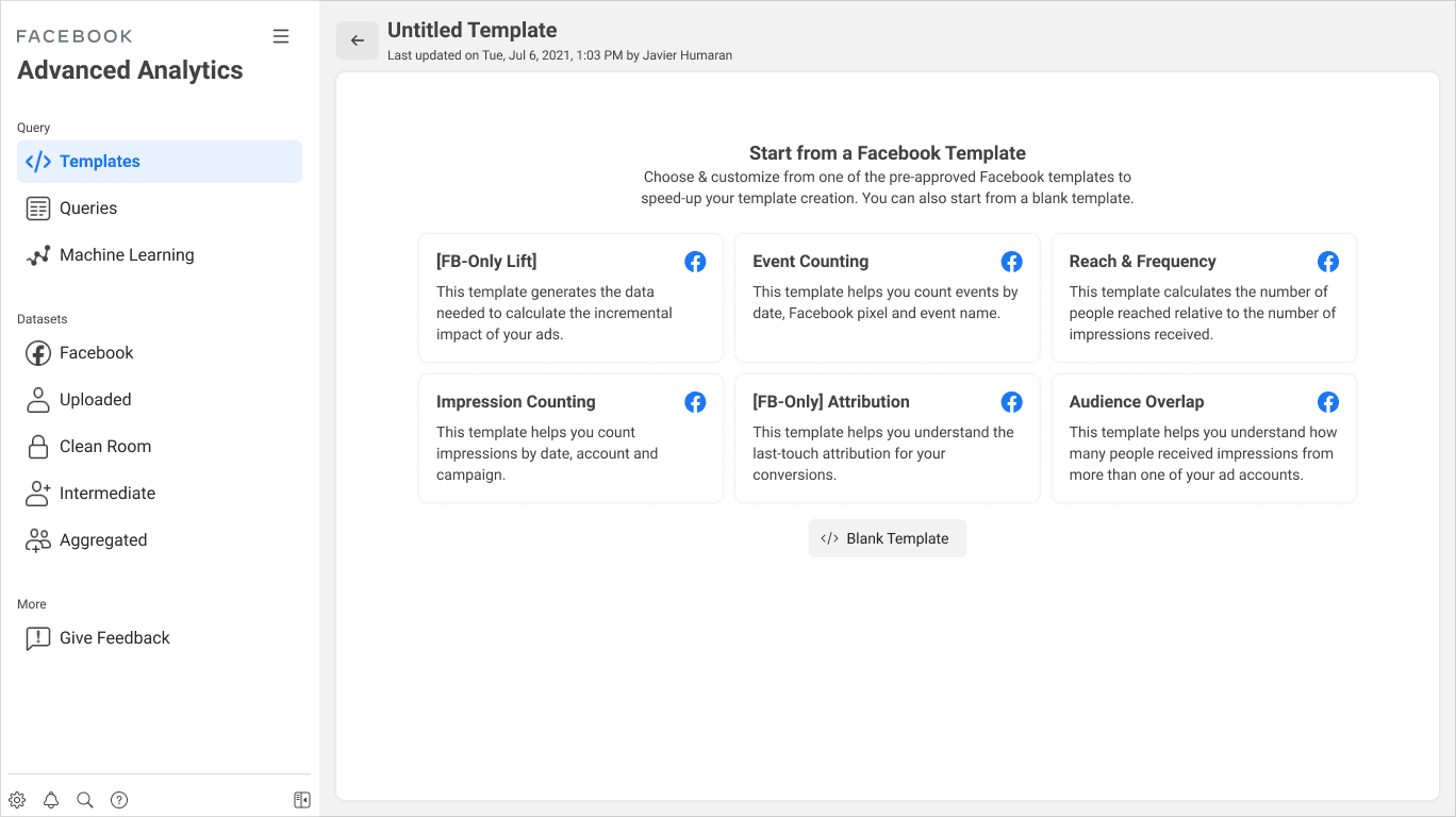
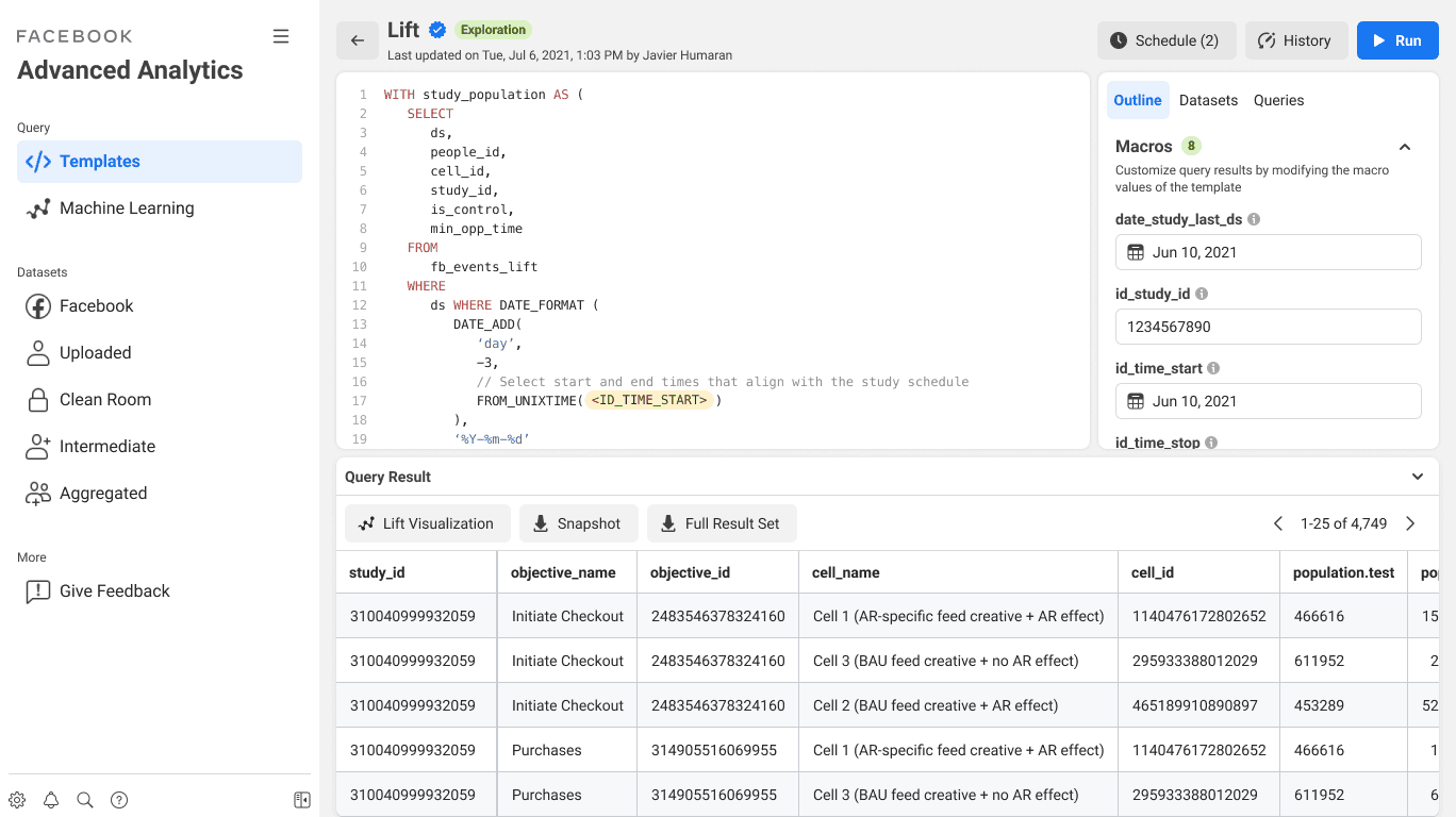
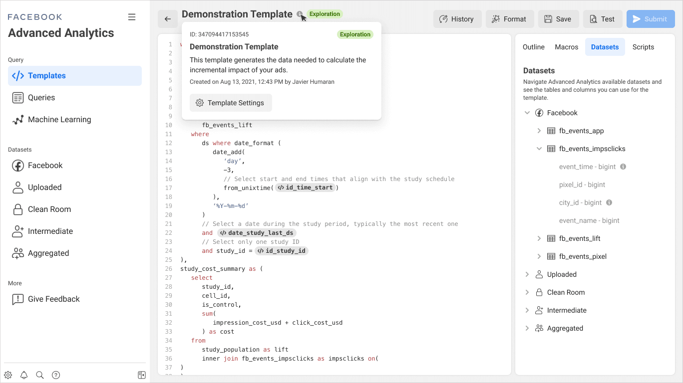
This is one of the main screens to manage data in the Advanced Analytics tool, shown after the redesign.
Key Features
Template Composer Redesign
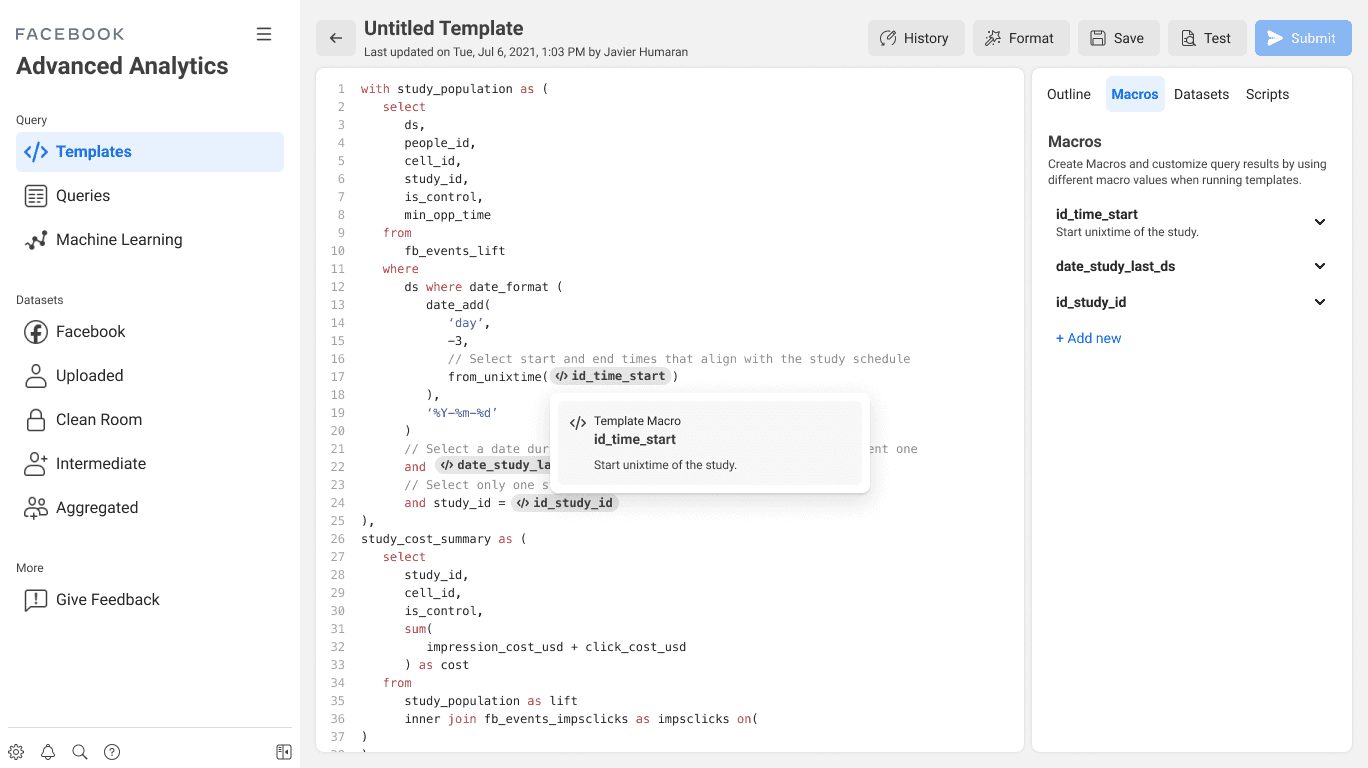
Simplified the creation of ad performance reports, allowing users to build templates without needing to write SQL queries.
User Guidance
Implemented onboarding flows and contextual help to assist users in navigating the tool's complex features.
Out-of-the-Box-Templates
Provided pre-built templates for common report types, enabling users to get started quickly without the need for advanced configuration.
Automatic Code & Template Validation
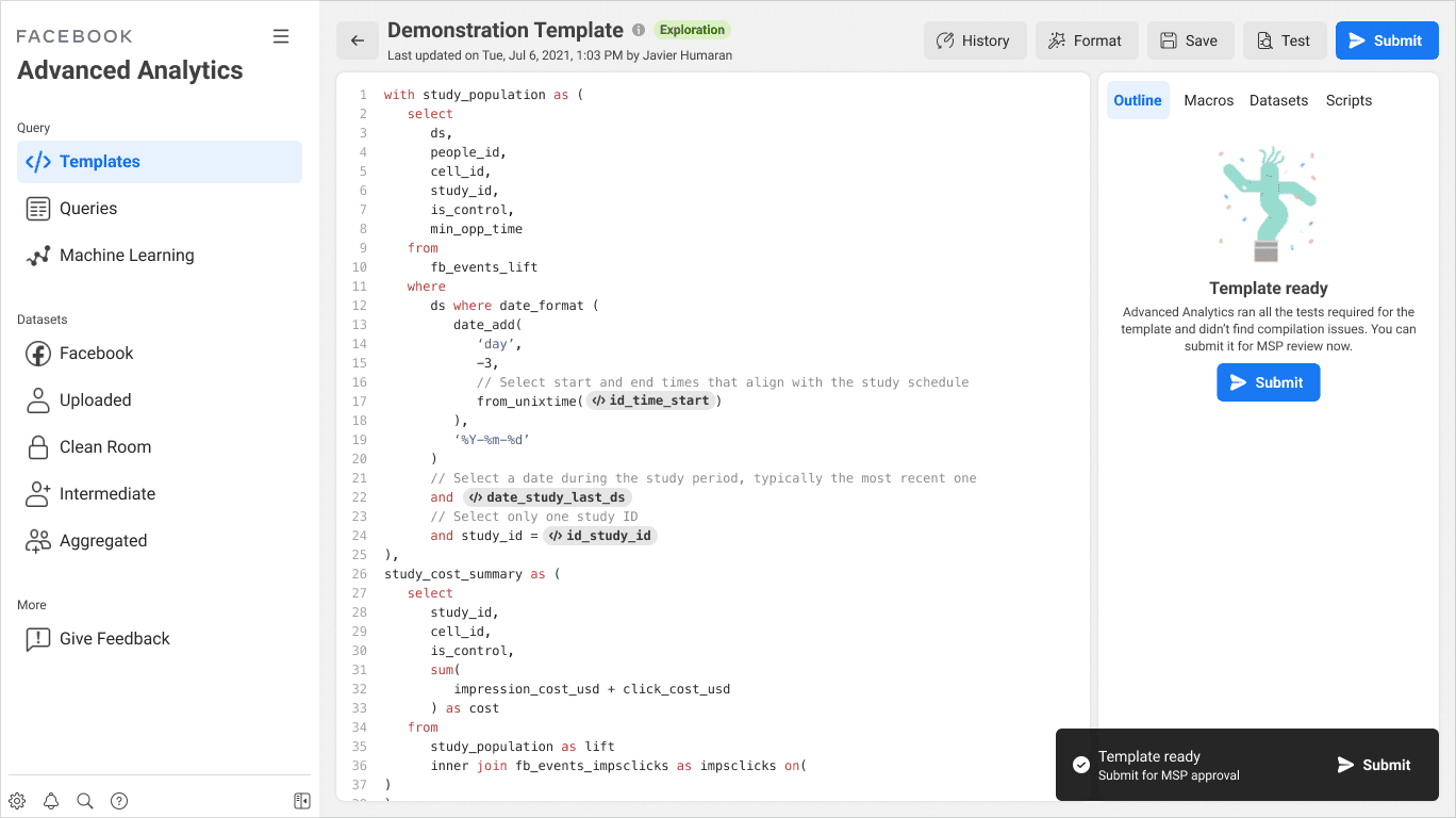
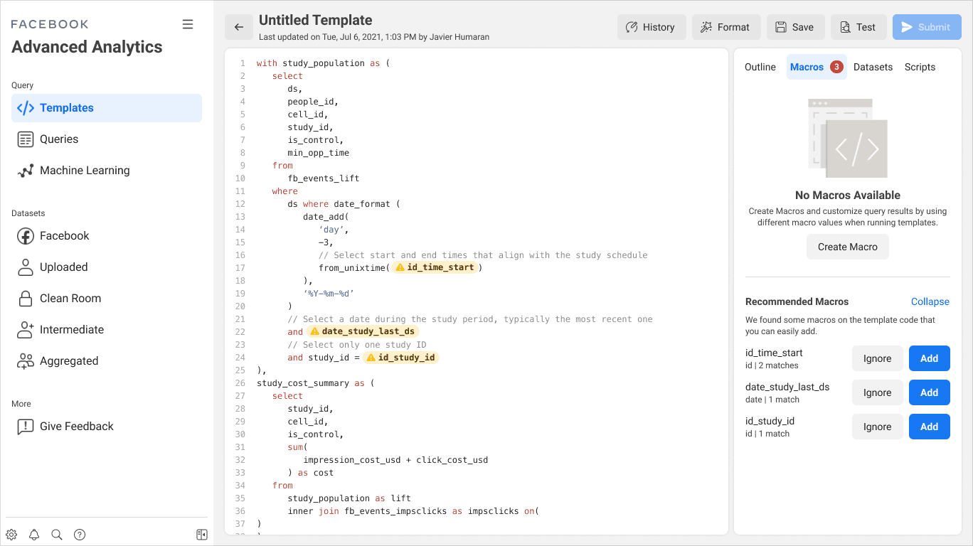
Introduced real-time validation to prevent errors, ensuring users could identify issues in templates and code before running reports.

Design Process
Product Roadmapping
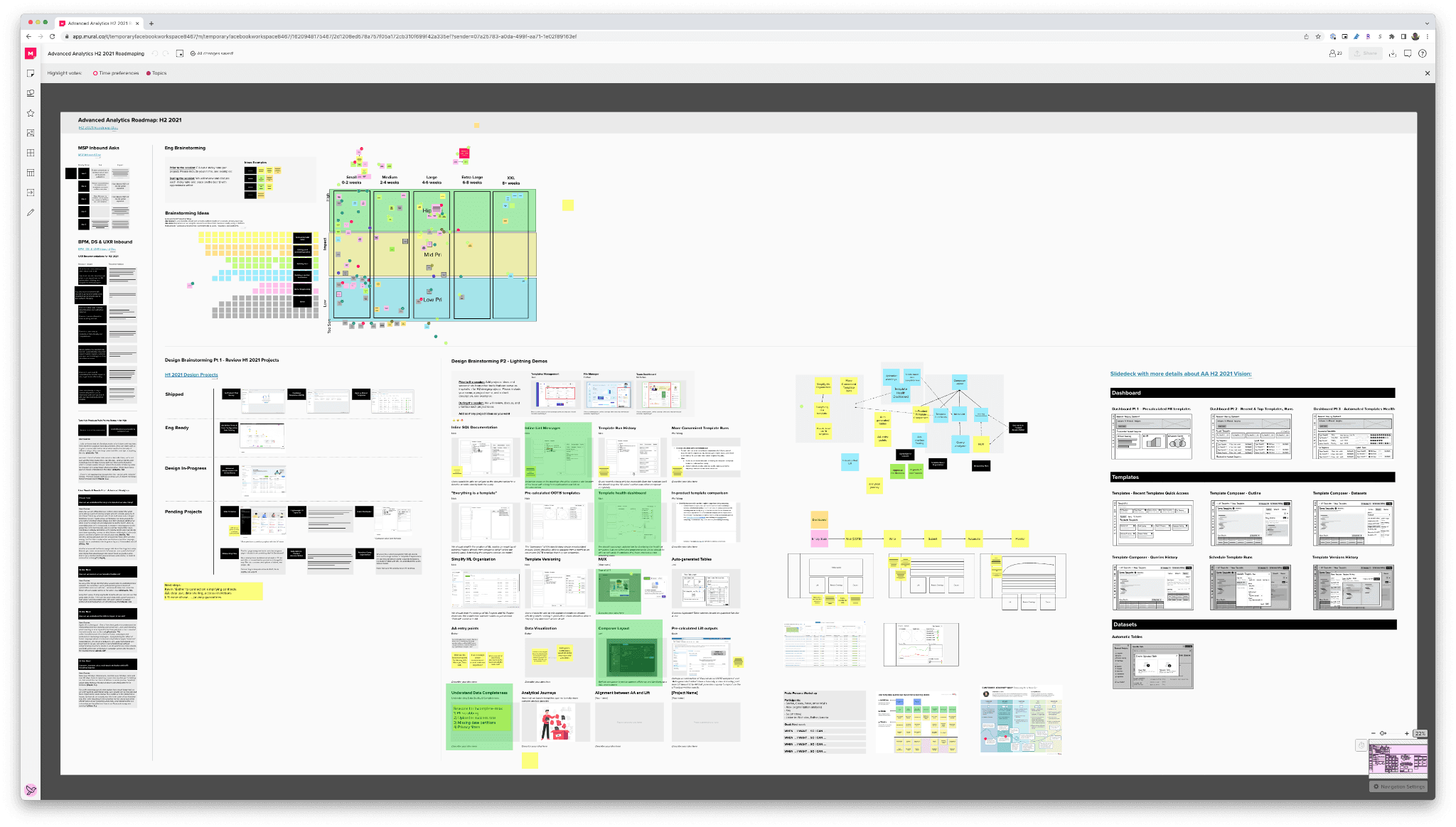
To address these challenges, I led a series of design workshops with cross-functional partners, including Marketing Science, Business Product Marketing, Data Science, and UX Research. These workshops helped define the problems we wanted to solve, prioritize features, and allocate engineering resources effectively.
Key Steps
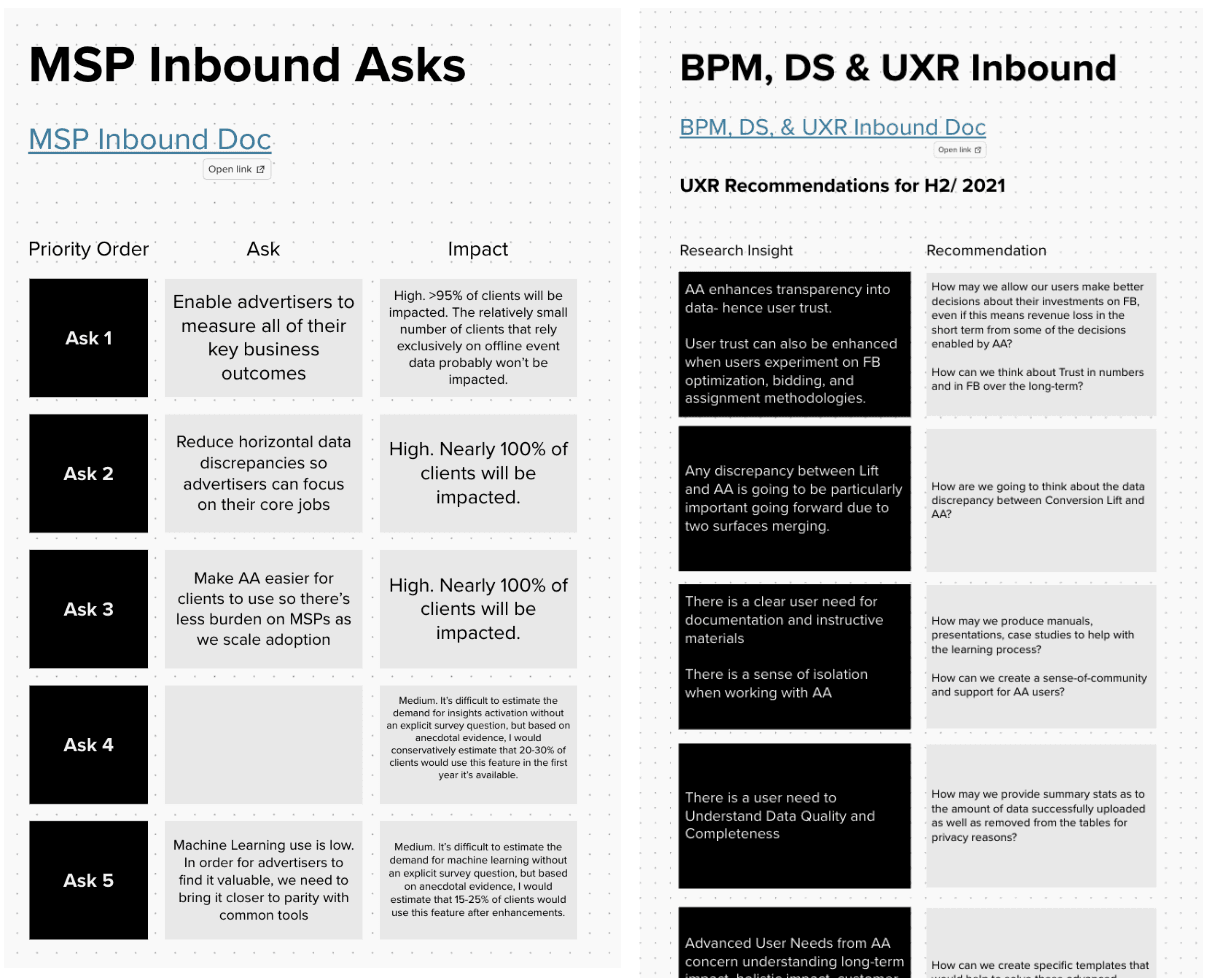
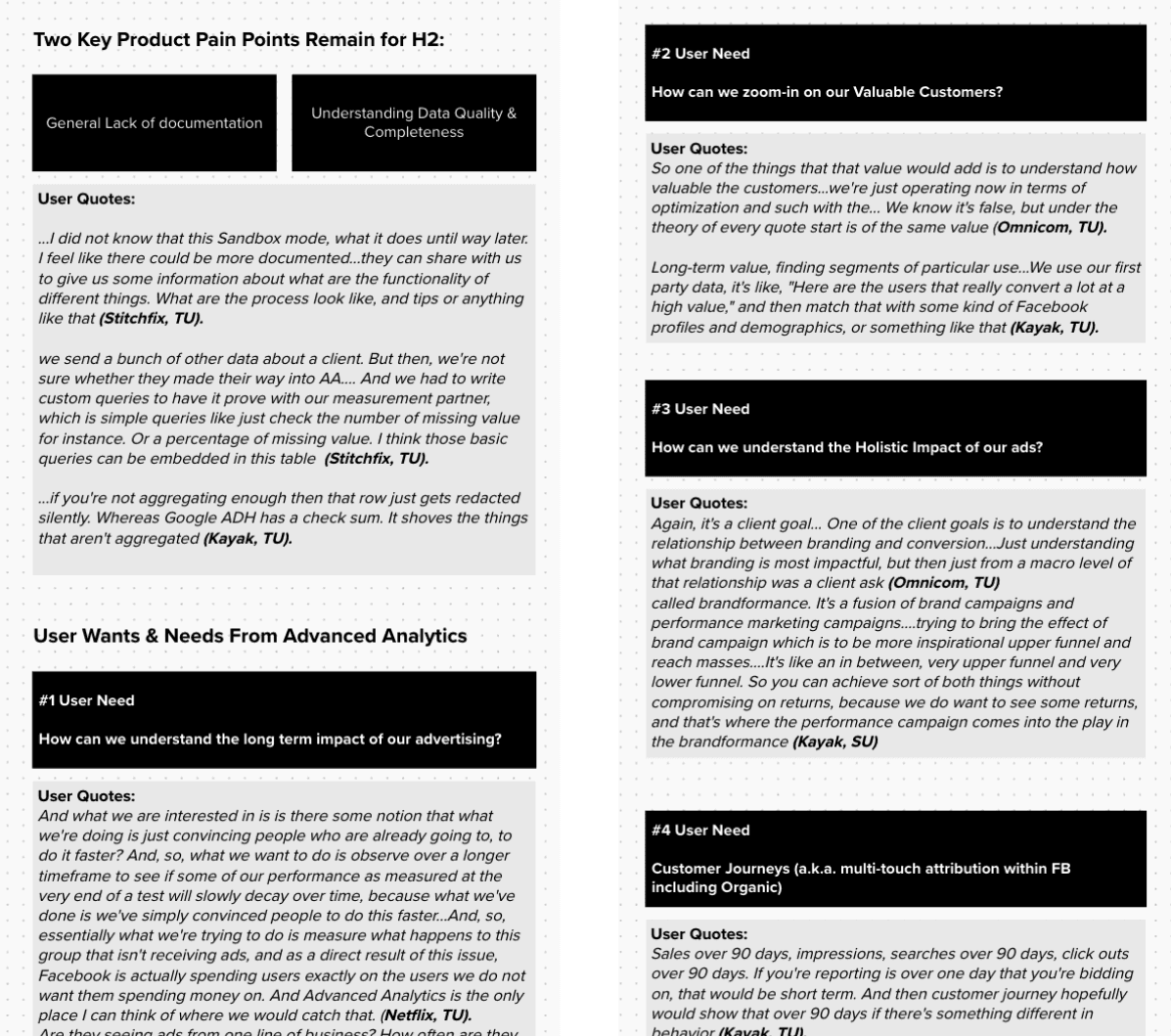
Research Inbound
Collaborated with stakeholders to synthesize insights from existing research, which informed our design decisions.
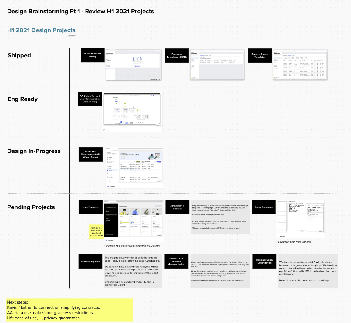
Design Projects Review
Prioritized the Template Composer redesign as our main focus based on stakeholder input and user research.
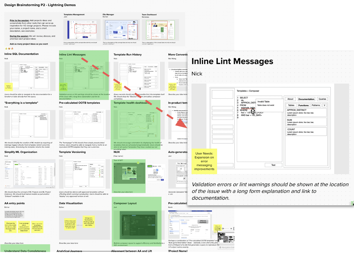
Lightning Demos
Conducted brainstorming sessions to gather ideas for future product features and understand how my cross-functional partners envisioned the product.
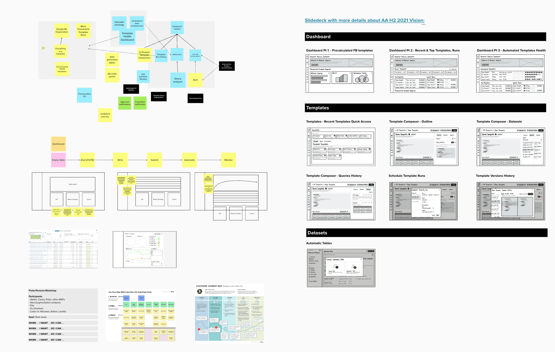
Whiteboarding Sessions
Worked closely with engineering to visually represent the proposed solutions and seek feedback from leadership.
Design Brief and Vision
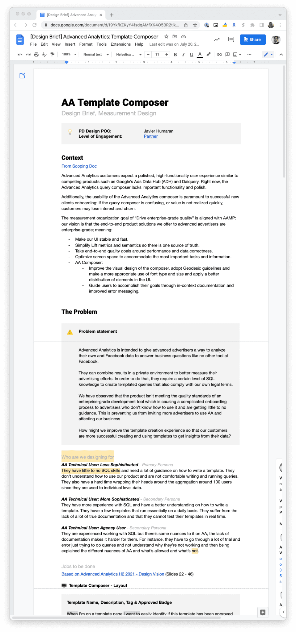
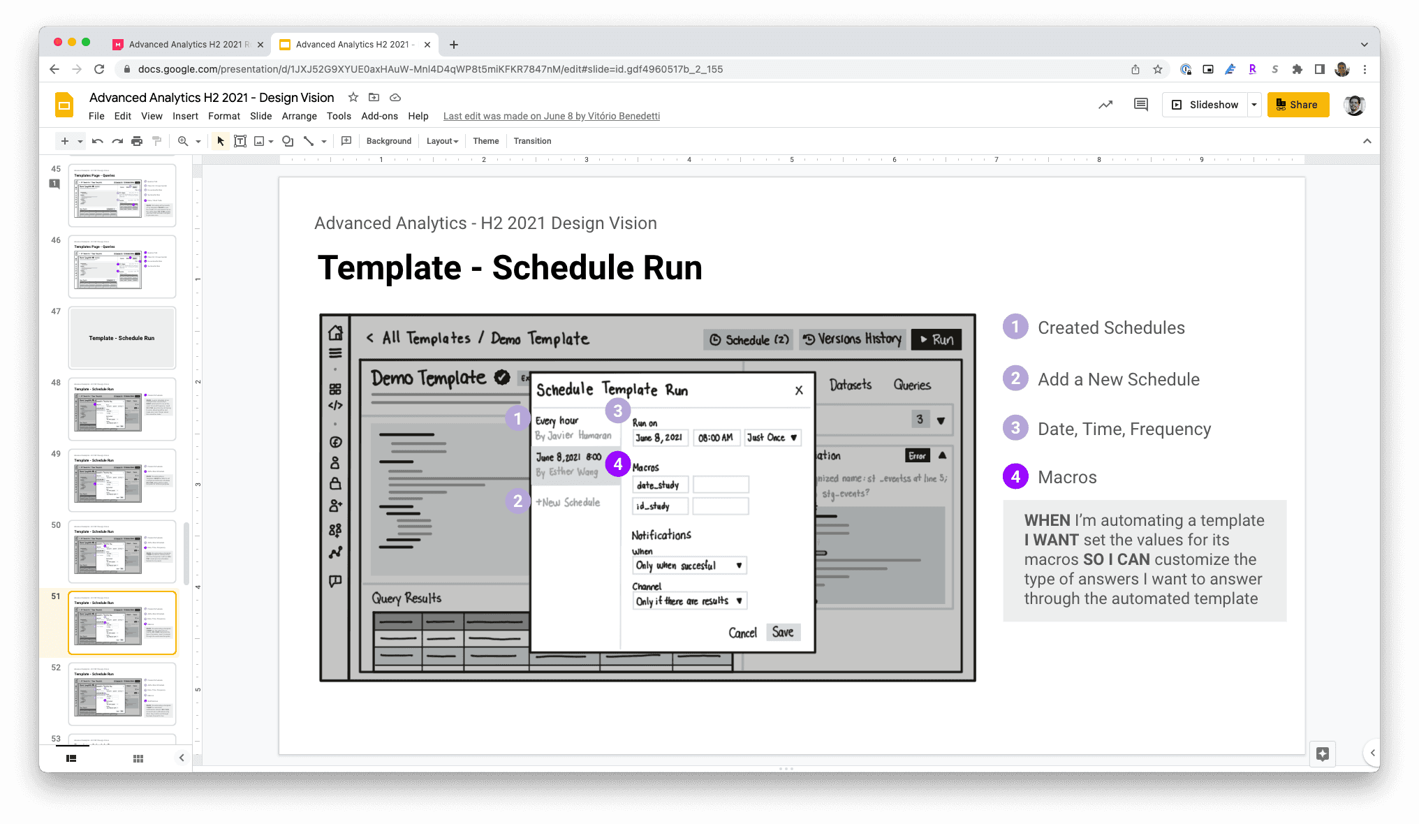
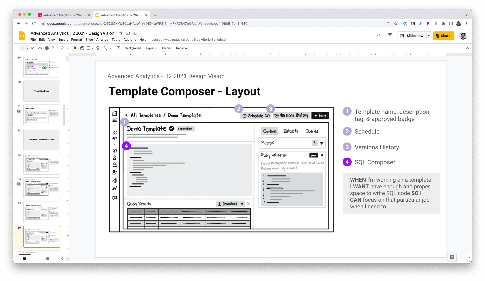
After the workshops, I created a design brief and a vision slide deck to summarize the user problems and our proposed solutions. This structured approach enabled me to present a clear roadmap to the leadership team, receive valuable feedback, and align the team on our goals.

Prioritization and User Story Mapping
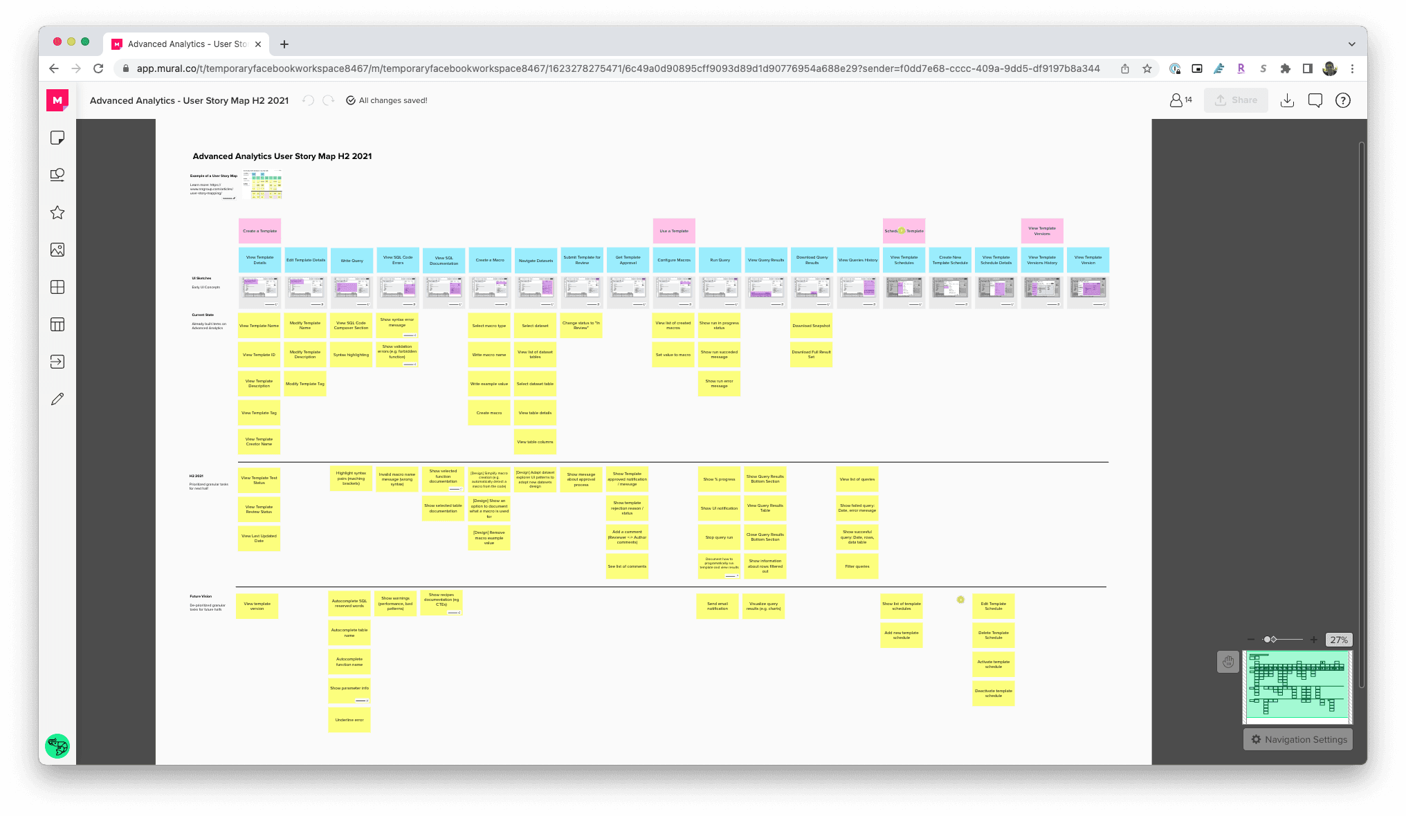
With feedback from leadership, I facilitated a working session with engineering and product management to define the sequence of work and releases. We used a User Story Map to break down the project into manageable phases, ensuring that the most critical features were developed and deployed first.
Design Execution
This phase involved taking the project from ideation to completion, ensuring that the final product addressed both user needs and business goals. The design execution was divided into five key phases: gathering inspiration, early explorations, initial designs, design critique, and final designs.
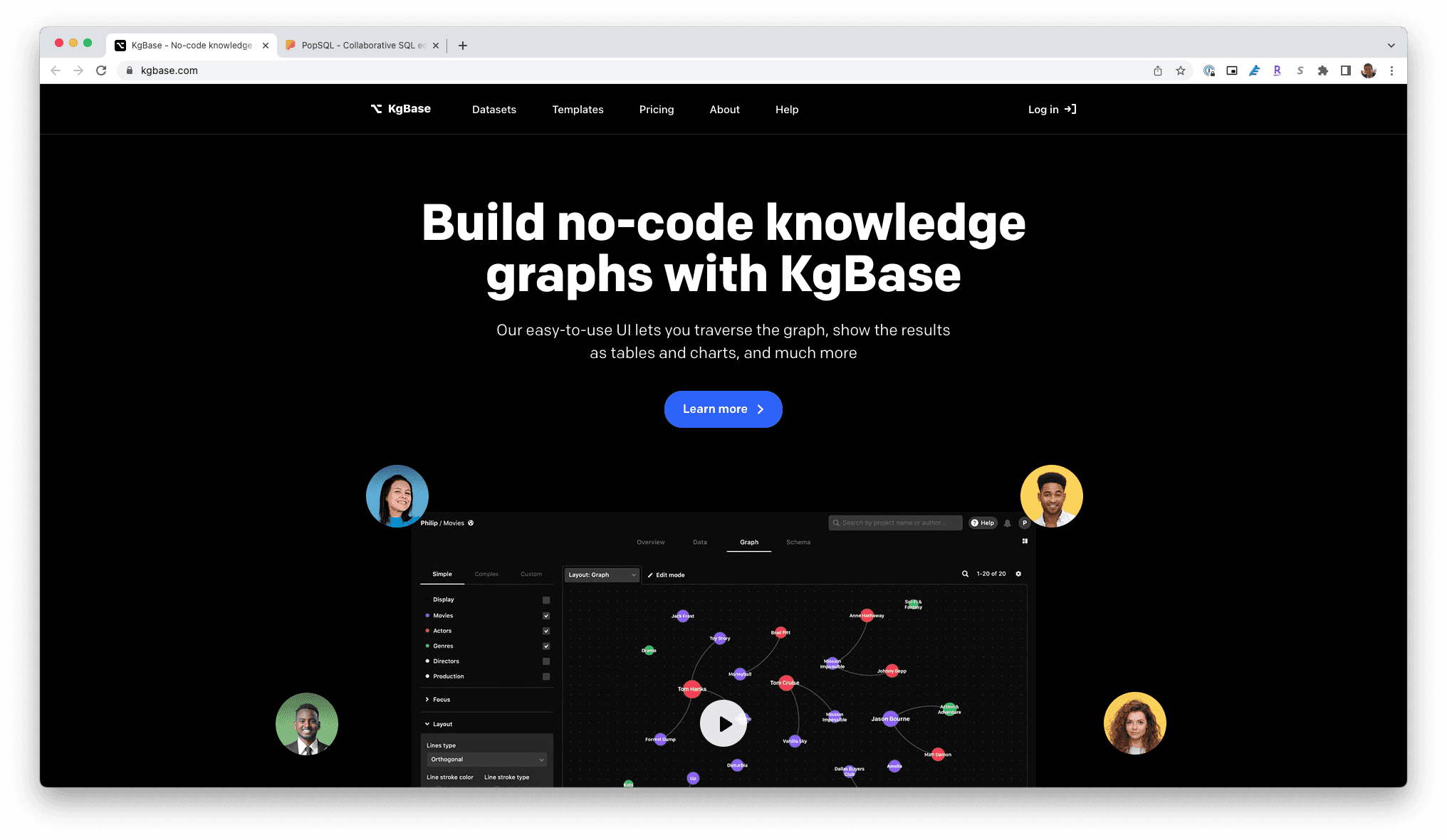
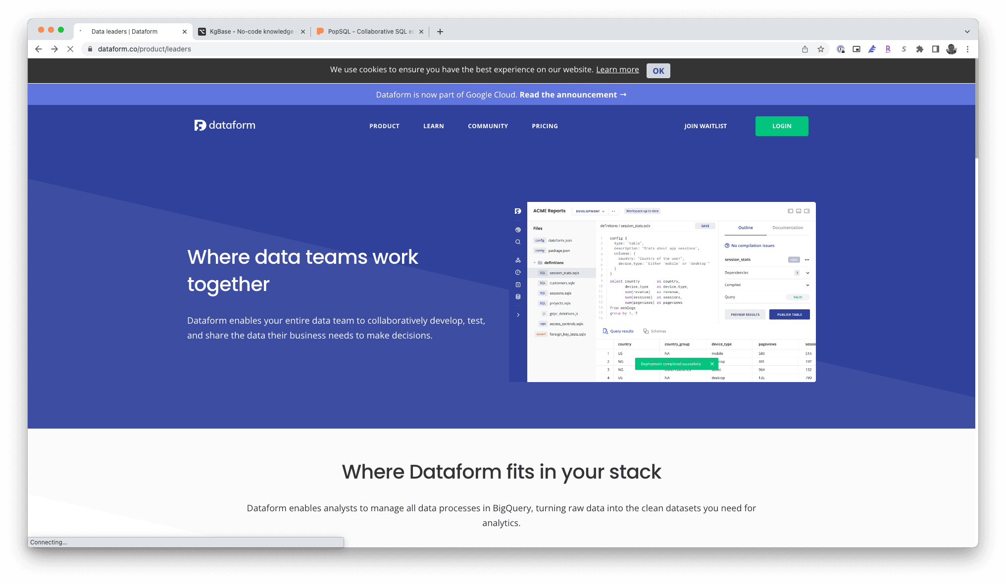
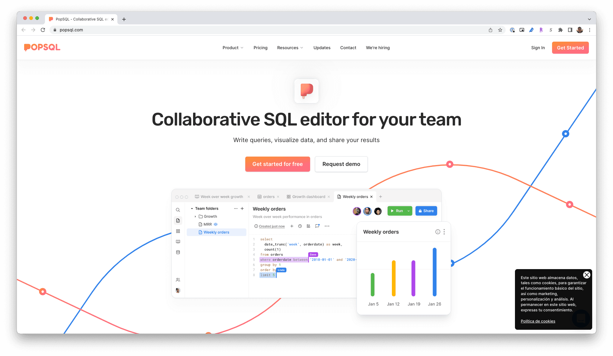
Gathering Inspiration
We analyzed similar tools to gather ideas for simplifying complex data interactions while maintaining advanced functionality. This provided a foundation for developing more intuitive features.
Early Explorations
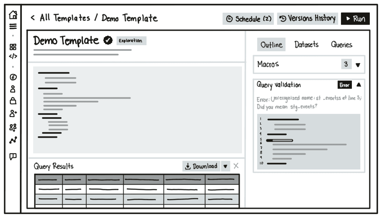
I led design explorations focused on reducing the need for technical expertise in template creation and dataset selection, iterating on potential interaction models.

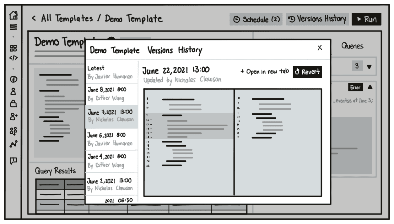
Initial Designs
Initial designs focused on usability, ensuring users could easily interact with templates and datasets. We structured these designs for testing to validate their effectiveness in solving the core problems.
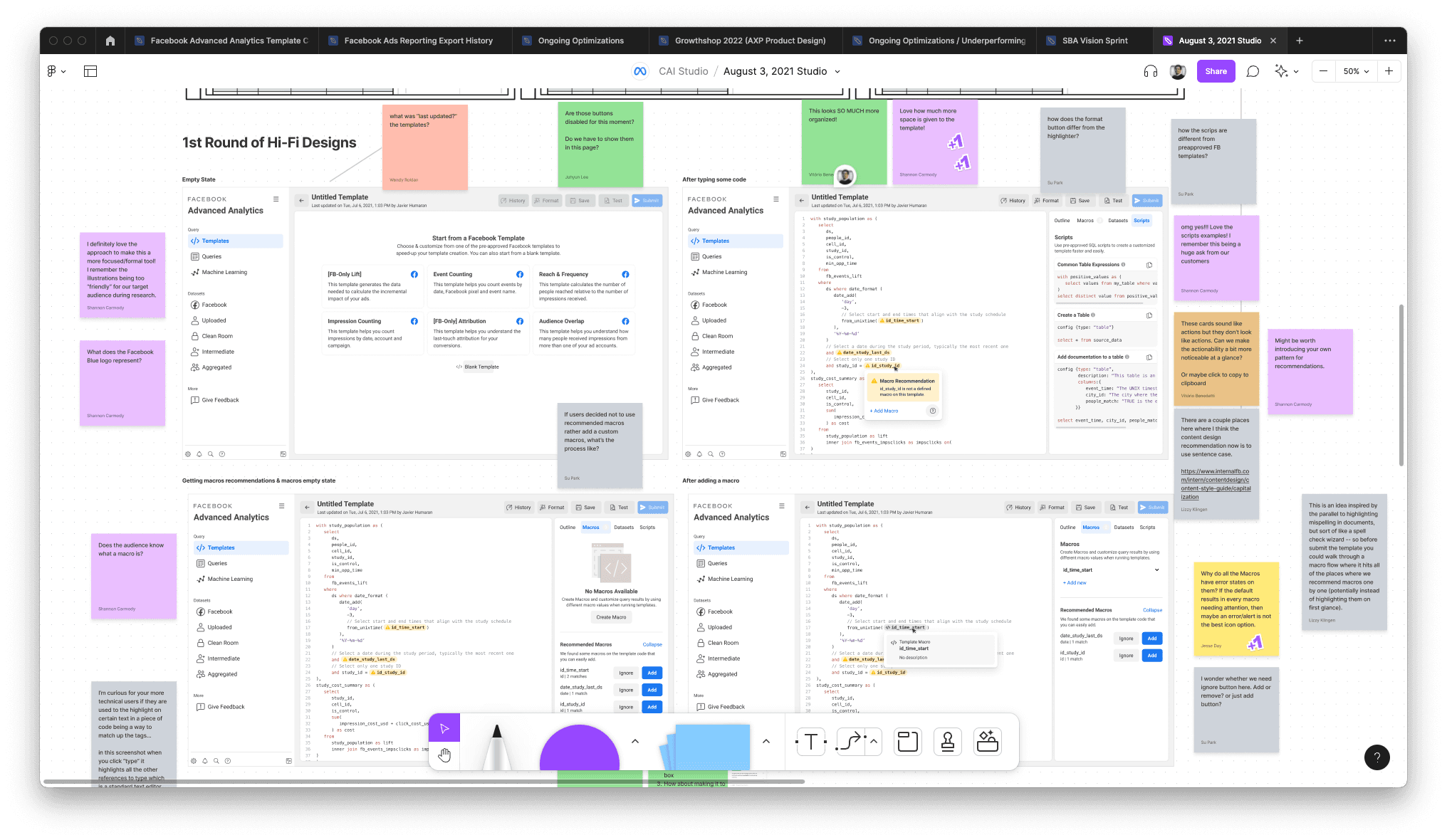
Design Critique
The design critiques allowed us to refine our work based on cross-functional feedback, ensuring we addressed any usability concerns and further simplified the user experience.
Final Designs
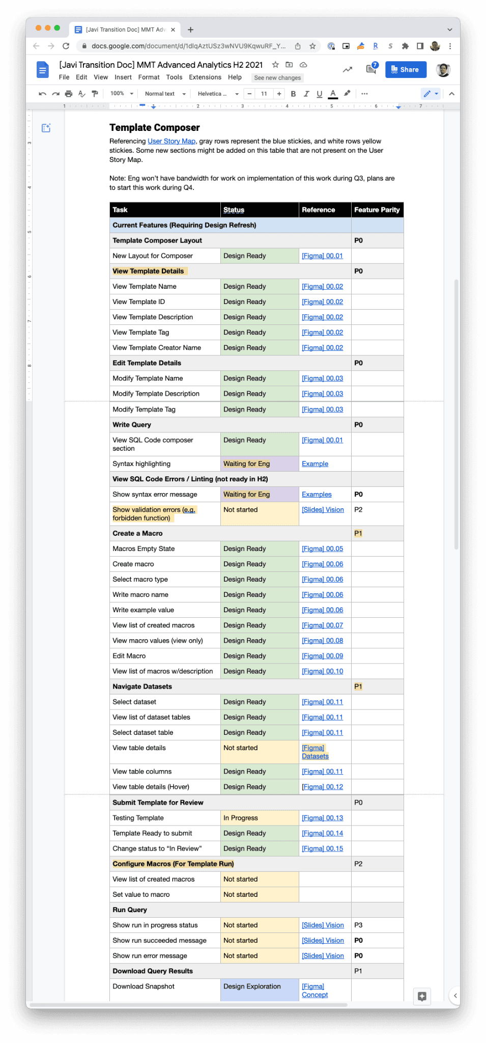
Final designs introduced a more streamlined interface for template creation and a cleaner layout for datasets, significantly reducing onboarding time and increasing adoption among non-technical advertisers. The handoff to engineering included detailed specifications and user story mapping.
Transition and Handoff
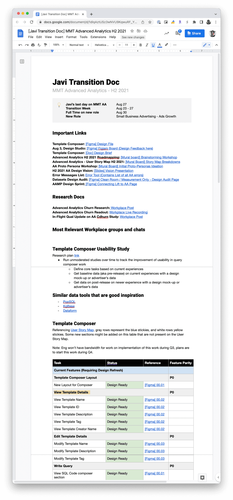
As the project neared completion, I transitioned to a new team within Meta. To ensure the project continued successfully, I created a detailed transition document to support my engineering partner during the implementation and future designers who would work on the tool.
Impact
Increased Adoption
After the redesign, adoption of the Advanced Analytics tool increased by 30% as more advertisers without technical backgrounds were able to use the tool effectively.
Reduced Onboarding Time
The simplified UI for template creation and dataset navigation reduced onboarding time for non-technical advertisers by 90%, allowing them to start using the tool much faster.
Higher User Satisfaction
User satisfaction scores improved by 25%, particularly among users who were previously frustrated by the technical complexity of the platform. Feedback highlighted the ease of use and intuitive navigation.
More Advertiser Invitations
The improvements enabled Meta to invite more advertisers to use the tool. The number of active users grew by 20% as the tool became accessible to a wider audience, helping Meta hit key business targets.
Disclaimer: Metrics have been rounded for easy reading

Challenges
🧩 Balancing Simplicity and Power
One of the main challenges was designing a tool that was simple enough for non-technical users but powerful enough to satisfy advanced advertisers. This required careful prioritization and frequent iteration to find the right balance.
🕰️ Limited Timeframe
With only six months to deliver the redesign, time was a constant pressure. Coordinating across multiple teams while ensuring design quality was a major challenge.
⚖️ Cross-Functional Alignment
Aligning the goals and expectations of stakeholders from various departments (UX Research, Marketing Science, Engineering) required clear communication and active facilitation of workshops and critiques.
🎯 Keeping Focus on User Needs
There was a risk of over-engineering the solution to cater to advanced users. The challenge was to keep the design focused on the core needs of the broader, less technical audience, which required pushing back on certain feature requests.
Conclusion
As a designer, this project taught me the importance of balancing complexity with simplicity, especially when dealing with technically demanding tools. I learned the value of cross-functional collaboration in shaping product decisions, as each team’s input was crucial in delivering a well-rounded solution. Facilitating workshops and aligning on a clear vision was key to navigating the project’s complexities.
The biggest takeaway was the importance of continuous iteration and user feedback. By staying close to the users’ needs and continually refining based on their feedback, we were able to create a product that significantly improved both user experience and business outcomes.
This project reinforced my belief that design is not just about creating beautiful interfaces, but about solving real problems for users in ways that drive tangible results.
Let’s Connect!
Feel free to reach out if you’d like to chat about design, collaborations, or just to say hi! I’m always excited to connect and share ideas.
javierhumaran@gmail.com
Crafted with passion in Colorado 🏔️🇺🇸
